How to View Daily Data by Month
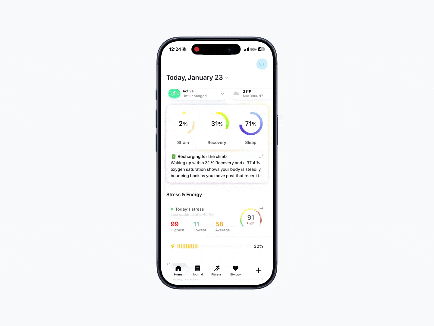
Bevel’s daily-by-month view lets you see how each day performed within a month at a glance. This view uses color indicators to quickly show whether a day was lower, moderate, or higher relative to your typical ranges.
This view is available across areas like Strain, Recovery, Sleep, Stress, Energy Bank, and Nutrition.
How to View Daily Data by Month
Open Bevel.
Scroll slightly down.
Tap the calendar icon in the top-left corner.
View daily metrics displayed for the selected month.
Switch between metrics by tapping the tabs at the top.
Change months by tapping the month and year dropdown at the top.
You’ll see a calendar-style grid where each day is color-coded for quick reference.
Note: In the Energy Bank metric, the dashed line represents the highest point of Energy in the day, while the solid line represents the lowest point of Energy in the day.